
The CMU Design Census
Data Visualization / Digital Design
Overview
The CMU Design Census is a 3D data visualization website that allows the current School of Design students to freely explore data about alumni.
Role
I helped design the video and the website. I also lead the concept behind the visual direction.
Teammates
I worked with Joey Lee, Steven Ji, Albert Yang, and Jessie Headrick.
Duration
The project lasted about 2 months
Outcomes
Our final deliverable was a website housing our survey results, data visualization, and a video that explains the concept.
Discovering Alumni Experiences Through Data
View the live site here.
The value of design varies wildly depending on the company or organization, or even the industry. Using data that we collected from alumni of the School of Design at Carnegie Mellon, we visualize the how closely alumni align to the companies and organizations that they have worked at.

Screenshots of the website.

CMU Design student uses the website to see where alumni have enjoyed working and why.
The Process
Please click here to see the full process documentation.
Sending Out the Census

We began with a google survey, which you can still view here! With our research, we wanted to learn about how CMU Design alumni’s jobs and industries (both past and present) align or clash with their philosophy or vision of design. Questions included:
“How does your industry fit your philosophy of design?”
“How does this reflect on your education and the industry itself?”
The survey was sent out to all CMU Design alumni in New York City.
Mining the Data
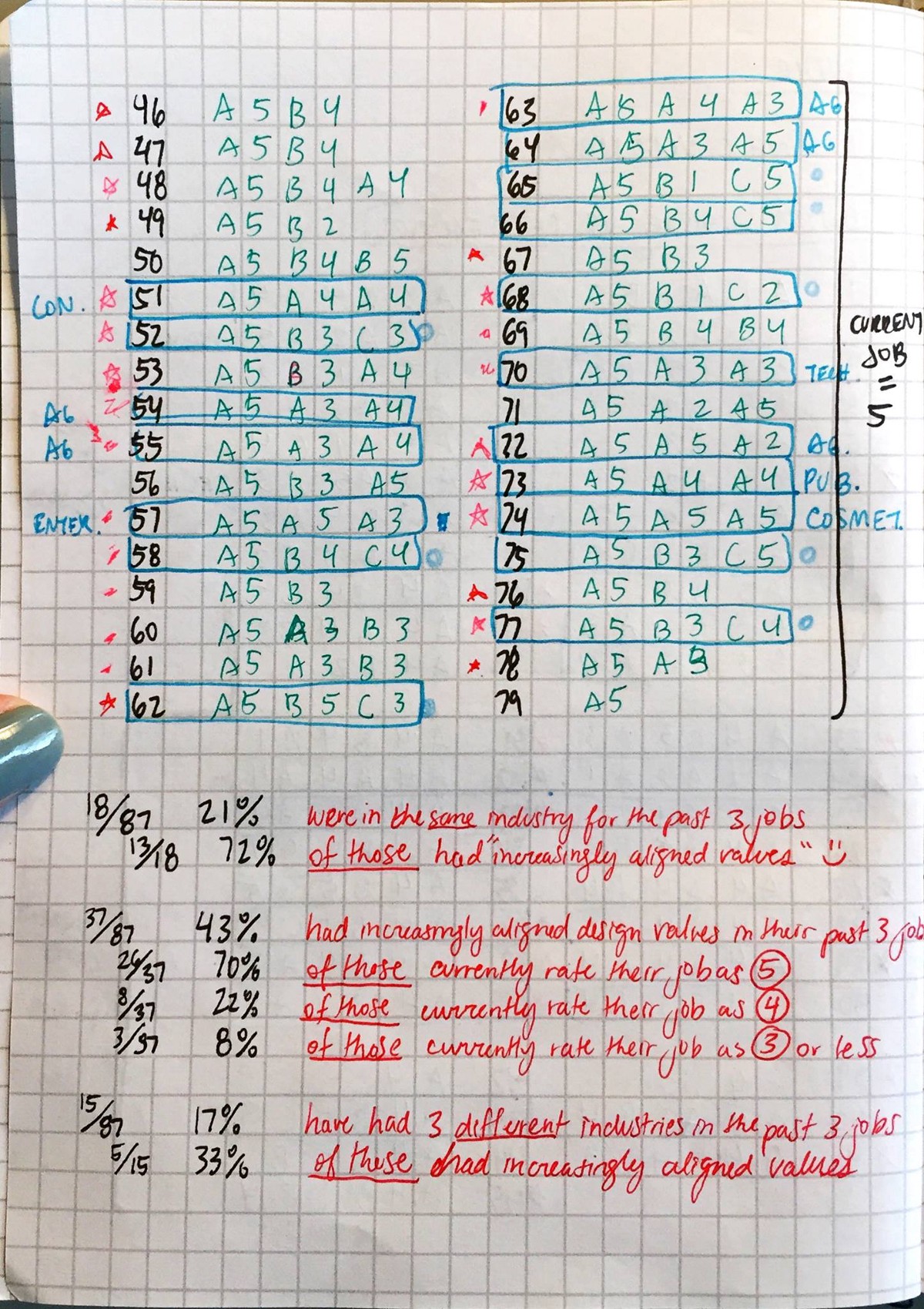
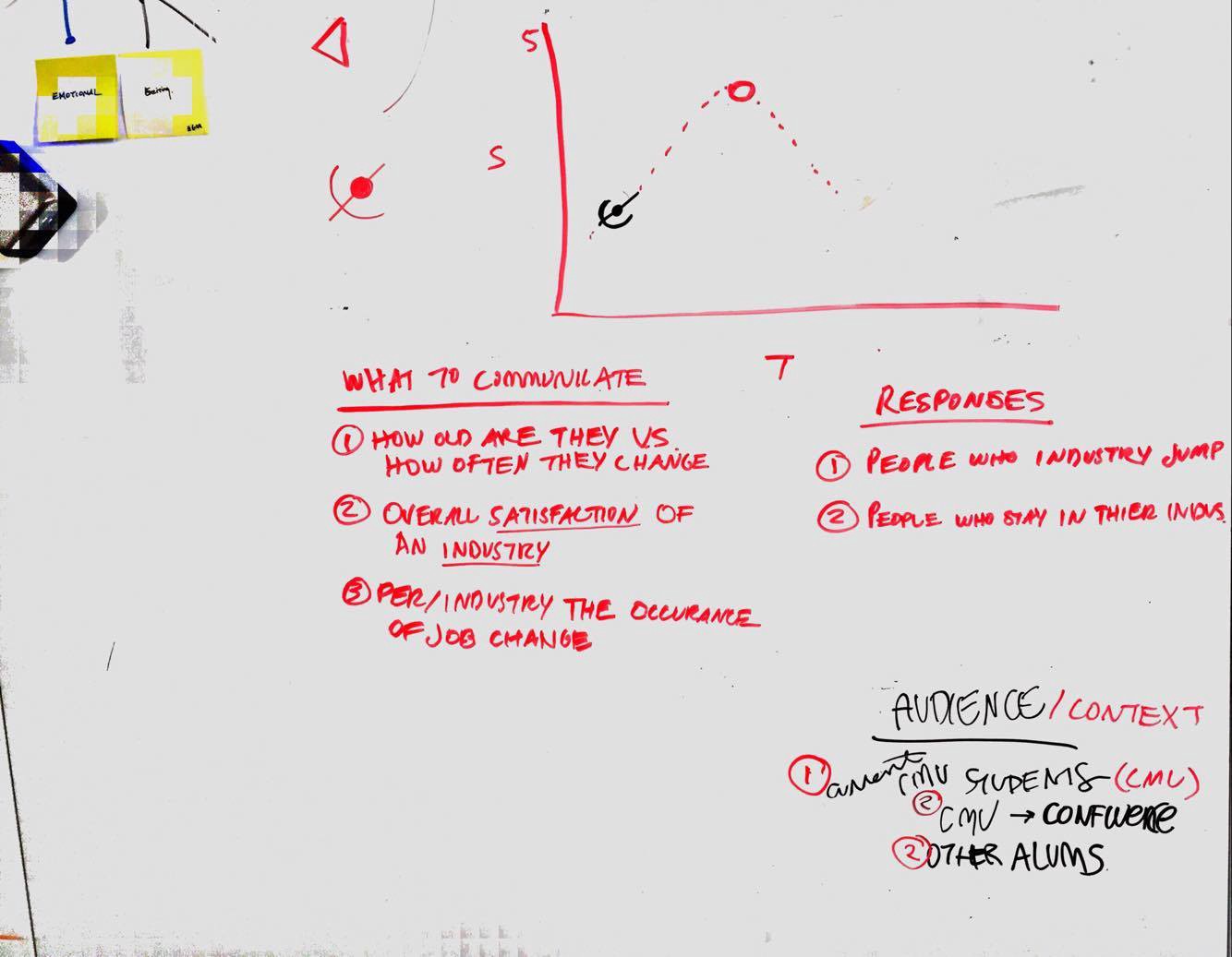

Eventually, we gathered our responses (roughly 90 of them!) and began exploring how to visualize this information.
It was important for the data visualization to have a discoverability quality because the audience we were designing for was students, who are trying to figure out what they might want to do. We wanted to show them that finding the right job means finding a job that aligns with your values. We decided to map designers’ alignment with their industry's/workplace's values.
Visual Concept

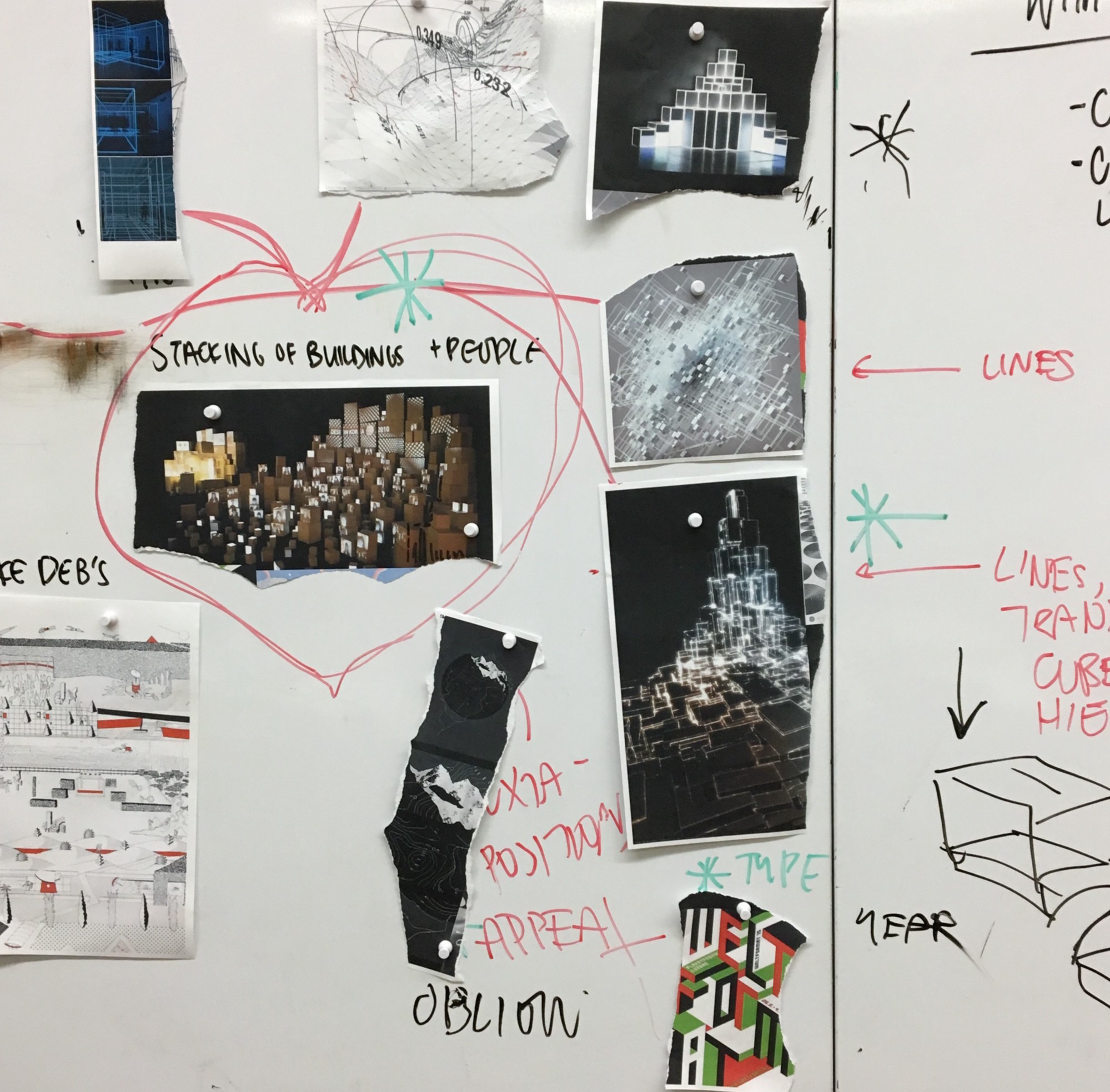
The inspiration for our visual direction was "Cubeville," a drawing exercise from Freshman Drawing Studio, where you create a city out of cubes. We thought this would be fitting because our responses were all from CMU designers living/working in New York City!
Refining Visuals


The challenge was how to connect the form of the cube to the way that the data is presented. We went so far as to think about exploring how to project the data onto physical cubes, where each face would display certain kinds of information. However, we decided to go with a more digital visualization, in which an interactive web platform would display 3D cubes that the user can explore.
To differentiate the different industries, we tried out different textures and imagery. In the end, we found color was most effective for immediate recognition.
Video Storyboarding


Joey and I worked together to create the video. We wanted it to act as an introduction to the website and an explanation of the visual language in the data visualization.
Video Iterations
Here is a log of how the video progressed. You can also see how our visual language evolved throughout the videos. We used 3D animation to match the 3D style of the interactive data that would be below on the website.
Website Design

I helped design screens of the website, and figure out interactions. The code was done fully by Jessie, Steven, and Albert.